Summary
Urban.co.uk saves you time and money when selling or letting your property, by charging you less and offering you more compared to a traditional estate or letting agent.
Having built the original website organically using multiple designers and agencies, the website had become tired and had a brand that would not scale.
Services
- Competitor Analysis
- Information Architecture
- Website Design
- Identity Design
- Print Design
- Front-end Development
- CMS Development
Results
Increase in revenue
When the new identity and website launched back in 2014 it resulted in a 60% increase in year on year revenue
Increase in trust
Urban.co.uk saw a 35% increase in the number of 5 star ratings received through TrustPilot
Consistent look across all marketing channels
Time was invested in developing a set of re-usable design principles that could work across all marketing channels, from physical "For Sale" or "To Let" boards to the main marketing website
Investment received
Research identified key opportunities. These opportunities were communicated clearly, with supporting information, into a guide designed for investors. This increased the number of investor meetings which resulted in Urban.co.uk achieving their funding goals.
Collaboration
A battle tested planning and design process guided us along the way from idea to finished product, allowing for plenty of collaboration between myself and the senior leadership team.
Jon is not only an excellent web designer he is a first class usability expert. He was passionate about doing good work and delivering a superior product. He challenged our thinking and got us think about different options/ideas. We have never had this from anyone we have worked with before. Very pleased with the outcome and Jon goes way beyond expectations.

Oliver Atkinson
CEO of Urban.co.uk
The Full Story
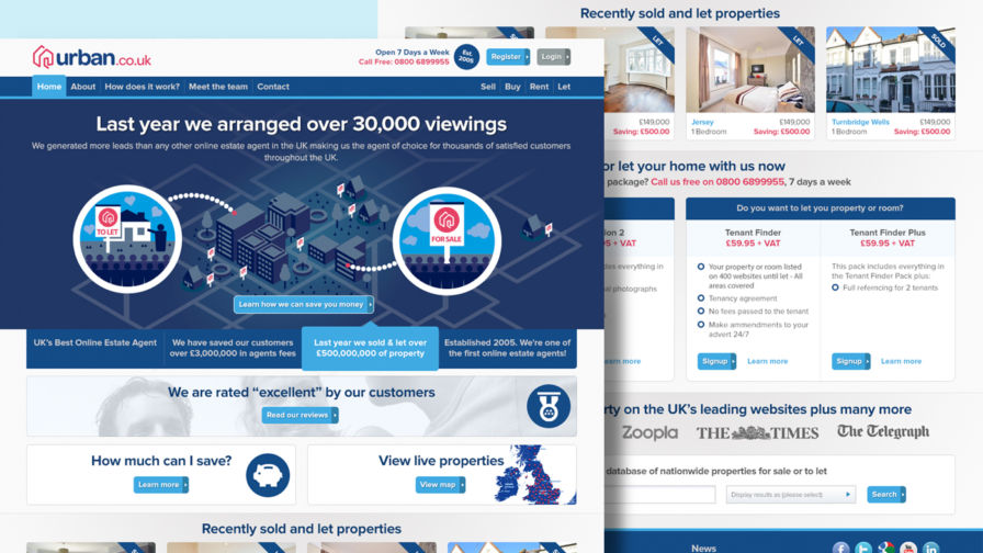
Using research to inform the re-design process
We began the project by conducting a homepage competitor analysis to see where we could improve and to confirm our strengths.
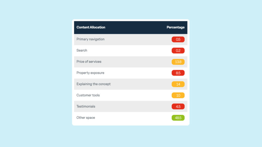
The aim of the report was to provide a summary that was guided by fact rather than opinion which can always be subjective. Therefore, the analysis focused on positive and negative UX experiences, website performance, social media and content allocation.
Looking at the competitors content allocation gave us insights in to what types of content competitors were using on their homepage in a binary way. Homepages were divided up into content groups and this “real estate” was scored accordingly. Groups included primary navigation, search, price of services, property exposure, explaining the concept, customer tools, testimonials and general white space.
From this point forward we were clear on what types of content should feature on the homepage and how it should be presented to our 3 primary segments. These were customers looking to sell their property, customers looking to rent a property and customers searching for a property to either rent or buy.
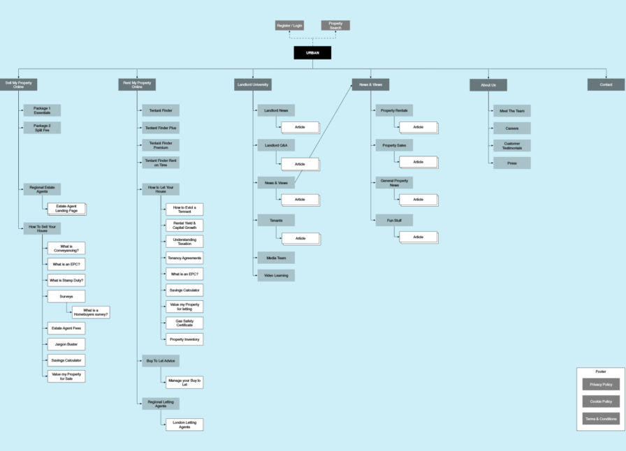
We then conducted a content audit which was helpful for understanding which content could be re-purposed or needed creating. Sitemaps allowed us to play with and re-group content into sections that made the most sense to our target audience.

From here, we started to create low level wireframe concepts that would eventually become the blueprints for the new website. The output from this phase was especially useful when communicating with Urban.co.uk’s development partner.
Design execution
The selected logo is typeset in Omnes. The beauty about this font is that it has many personalities. With the right application it can come across playful or serious - a worthwhile investment. The typography is supported by a single line that creates an isometric house with an open door.
The colour palette features re-assuring and trustworthy blues paired with a splash of magenta which is bright and attention grabbing.
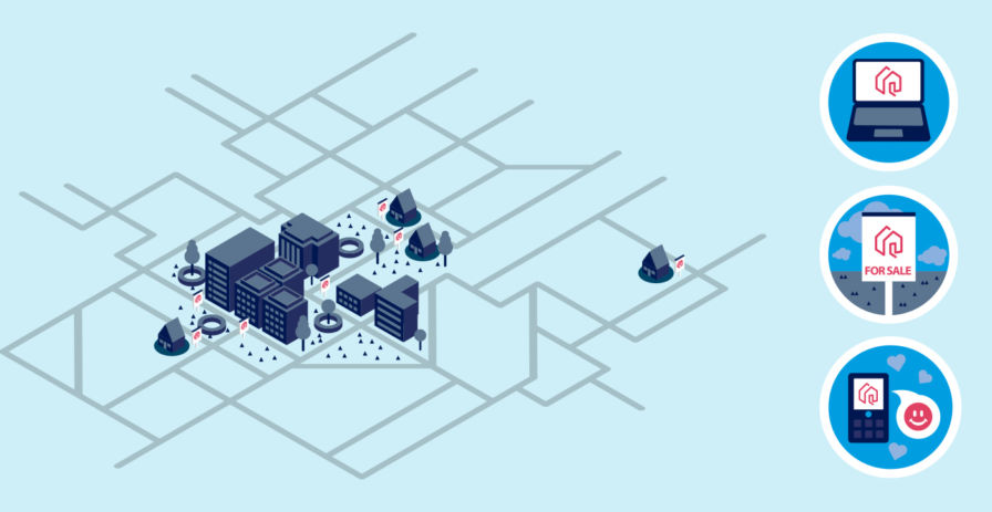
A set of custom illustrations and icons were designed that explored the themes around technology and how it can save you money when selling or letting your property. These were used in animations for video, on the website and in printed material.
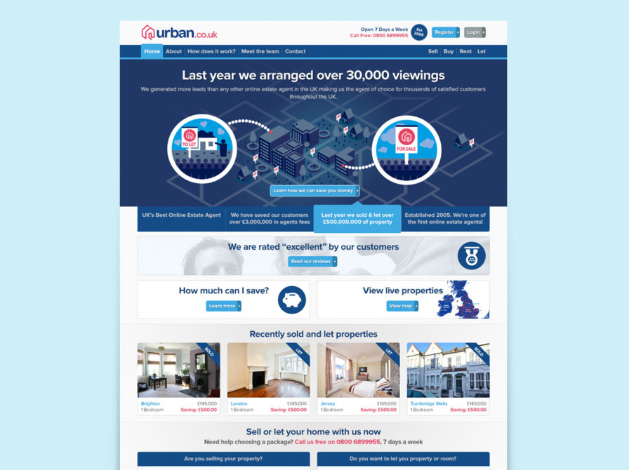
While design research led us towards a "less is more" approach, giving primary focus to explaining the concept and the pricing of the product, communicating to both sellers and renters meant we had to expand the content on the homepage to cater for both needs.
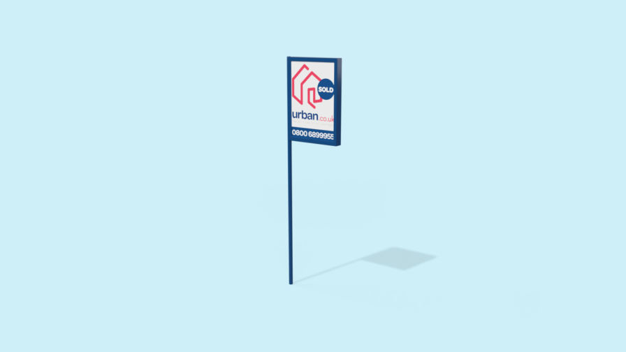
Design assets were re-purposed to create "for sale" and "to let" boards which appeared outside properties competing with traditional estate and letting agents.
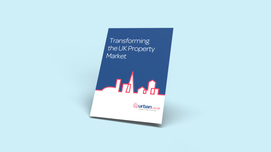
I also created an investment brochure which highlighted some of the outcomes from the planning phase of the project.
Read this next